How to Screenshot a Website at Mobile, Tablet and Desktop Sizes on Mac
Need the same webpage at phone, tablet and desktop widths? Here is how to screenshot a website at different screen sizes on Mac, with Chrome DevTools, Firefox Responsive Design Mode and Shotbase's webpage capture, including full page captures, common breakpoints and how to capture a site in dark mode.
· 8 min read
Key takeaways
- Chrome DevTools and Firefox Responsive Design Mode can both resize a page to any width and take a screenshot, for free.
- Chrome's width presets are 320, 375, 425, 768, 1024, 1440 and 2560 pixels, and Tailwind's default breakpoints are 640, 768, 1024, 1280 and 1536 pixels.
- Shotbase's webpage capture lets you capture a page at mobile, tablet, desktop or any breakpoint, as a full page or just the viewport, in light or dark mode.
- For dark mode, a site must support it. Sites that use prefers-color-scheme follow your light or dark setting.
- Capture every size in the same session and keep the files together so you can compare them.
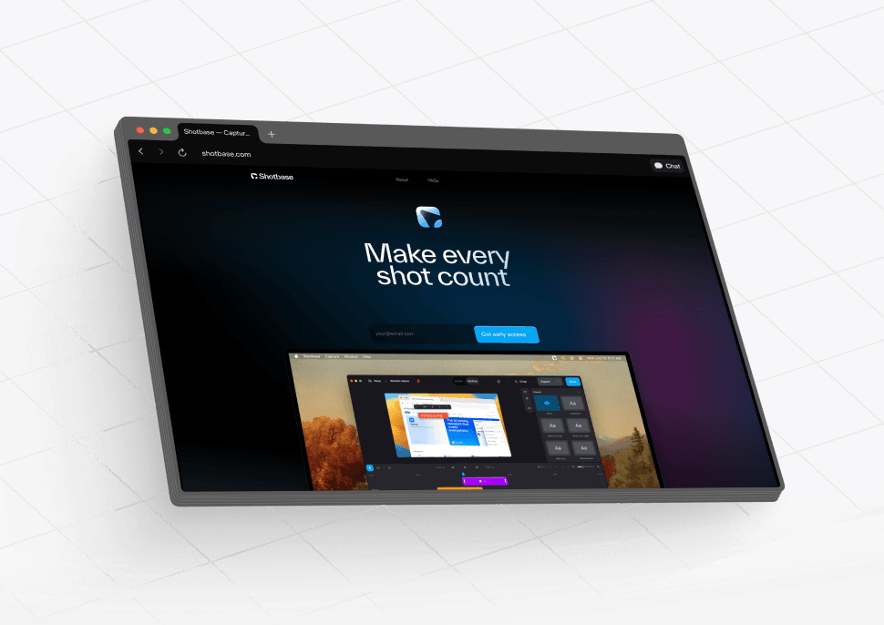
Short answer: to screenshot a website at different screen sizes on Mac, set the page to the width you want and then capture it. In Chrome that means DevTools device mode, in Firefox it is Responsive Design Mode, and both are free. In Shotbase (our app), the webpage capture tool does it in one step: enter the URL, choose mobile, tablet, desktop or any breakpoint, and capture the full page or just the viewport, in light or dark mode.
Below you will find the steps for each method, the sizes worth capturing, and how to capture a site in dark mode. Browser steps come from Chrome's and Firefox's documentation, and Shotbase details come from its website and changelog, all checked in November 2026.
Why capture a website at different screen sizes?
A responsive site changes its layout as the screen gets narrower. Menus collapse, columns stack and images resize. A single desktop screenshot tells you nothing about that. People capture a site at several sizes to:
Check a layout before a launch or after a change.
Report a bug that only shows on phones, with a screenshot of exactly what the user saw.
Build a portfolio or case study that shows a design working on every device.
Document a competitor's pages or save how a page looked at a point in time.
Compare breakpoints side by side while you design.
The macOS Screenshot toolbar (Shift + Command + 5) captures whatever is on your screen. It cannot make a page narrower, so you would have to resize your browser window by hand each time. The methods below are faster and more exact.
Which screen sizes should you capture?
You do not need every device. Pick the widths where your layout changes, plus the common ones.
Chrome's device toolbar offers these width presets:
| Preset | Width |
|---|---|
| Mobile S | 320 px |
| Mobile M | 375 px |
| Mobile L | 425 px |
| Tablet | 768 px |
| Laptop | 1024 px |
| Laptop L | 1440 px |
| 4K | 2560 px |
If your site uses Tailwind CSS, its default breakpoints are 640 px, 768 px, 1024 px, 1280 px and 1536 px. Other frameworks and custom CSS use their own values, so check your stylesheet for the @media rules your site uses.
A good starting set is three captures: a phone (375 px), a tablet (768 px) and a desktop (1440 px). Add more only where the layout changes.
Method 1: Chrome DevTools (free)
Chrome's device mode is the most common free way to do this. Its documentation calls it a first-order approximation of how a page looks on a mobile device, which is exactly what you need for a screenshot.
Open the page in Chrome.
Open DevTools. You can press Command + Option + I, or use the Chrome menu, then More Tools, then Developer Tools.
Click the Toggle device toolbar icon in the action bar at the top of DevTools.
Leave Dimensions on Responsive, then either drag the viewport handles, type a width and height, or click one of the width presets above.
Open the More options menu and choose Capture screenshot to save what you see in the viewport.
To capture the whole page, including content below the fold, choose Capture full size screenshot from the same menu.
Two useful extras from the documentation:
To see your site's media query breakpoints above the viewport, choose More options, then Show media queries. Click between the bars to jump the width so a breakpoint triggers.
If you pick a specific device in Device-specific mode, you can choose Show device frame first, and the screenshot will include the device frame.
Good for: developers who already have DevTools open and need a quick capture. Less good for: repeating the same set of sizes many times, or keeping the results organized, because each size is a separate manual capture.
Method 2: Firefox Responsive Design Mode (free)
Firefox has a similar tool. Its documentation says that with Responsive Design Mode enabled, the content area is set to the size of a mobile device, starting at 320 by 480 pixels.
Open the page in Firefox and turn on Responsive Design Mode from the browser's developer tools.
Choose a device from the list just above the viewport, or edit the width and height values directly. You can also drag the bottom right corner of the viewport to the size you want.
Click the camera button on the right of the toolbar to take a screenshot.
Screenshots are saved to Firefox's default download location. If you turn on "Screenshot to clipboard" in the Developer Tools settings, the screenshot is copied to the clipboard instead.
Safari has a responsive simulation tool too. It is described in Apple's Safari Developer Help under "Simulate responsive web content on Apple devices".
Method 3: Shotbase webpage capture
Shotbase has webpage capture built in, so you do not need to open DevTools or resize windows. According to its website, you can:
Capture mobile, tablet, desktop or any breakpoint.
Capture the entire page or only the viewport you need.
Capture any page in light or dark mode.
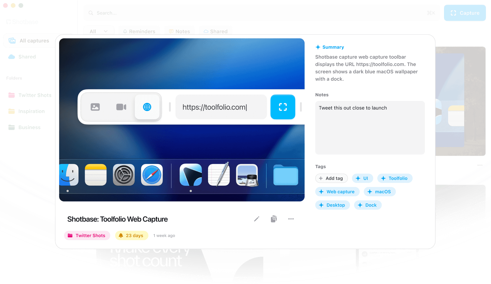
The capture bar has a URL field and a capture button. It shows the capture size (1920 by 1080 in the example below), a Scroll option and a Config option. Shotbase also has a dedicated keyboard shortcut for webpage capture, added in version 1.4.0.

Here is the workflow for a three size set:
Start a webpage capture in Shotbase and enter the URL.
Choose mobile, then capture. Do the same for tablet and then desktop. Use the full page option when you need the whole length, or the viewport option when you want only what fits on one screen.
Repeat in dark mode if the site supports it.
Open each capture in the editor to add a background, frame, shadow or border, or to add annotations such as arrows, text and highlights.
Because the captures go to the same library, you keep the phone, tablet and desktop versions together. On Macs with Apple silicon, Shotbase can name, tag and summarize each capture with on-device AI, and search also finds the text inside your screenshots. That helps a month later, when you are looking for the pricing page from before the redesign.
If you also want a longer capture of an app that is not a webpage, Shotbase has scrolling capture that works in any app. Our guide to taking a scrolling screenshot on Mac covers it.
Price: a 7-day free trial with no card required. Shotbase Pro is $13 a month billed yearly ($156 a year), or $25 month to month. After the trial you can still capture, view, edit and organize, but exporting new work needs Pro.
Skip it if: you only need one capture, once, and you are happy using DevTools. Local AI features also need a Mac with Apple silicon.
Which method should you choose?
| Method | Choose the size | Capture | Cost | Best for |
|---|---|---|---|---|
| Chrome DevTools | Width presets, drag handles or typed values | Viewport, or full size screenshot | Free | Developers who need a quick capture |
| Firefox Responsive Design Mode | Device list, typed values or drag | Camera button | Free | Firefox users |
| Shotbase webpage capture | Mobile, tablet, desktop or any breakpoint | Full page or viewport, light or dark mode | 7-day free trial, then from $13 a month billed yearly | Repeating the same set of sizes and keeping the results organized |
How to screenshot a website in dark mode
Dark mode is not something a screenshot tool can invent. A site has to support it, and most modern sites do this with the prefers-color-scheme CSS media feature. According to MDN, this feature detects whether the user has requested a light or dark theme, and the preference comes from an operating system setting or a browser setting.
That gives you two free ways to capture a site in dark mode:
Switch your Mac to dark appearance. Go to System Settings, then Appearance, and choose Dark. Sites that follow your system setting will switch, and then you can capture them.
Emulate it in Chrome. In DevTools, open the Rendering tab, find Emulate CSS media feature prefers-color-scheme, and choose prefers-color-scheme: dark. Then take your screenshot as usual. Chrome's documentation also lists prefers-color-scheme: light and No emulation as options.
If you use Shotbase, webpage capture can capture a page in light or dark mode, so you can build a light and dark pair for each size. Whether a site actually changes depends on whether it supports dark mode itself.
Tips for a clean set of screenshots
Capture in one session. Pages change. Taking every size within a few minutes keeps the content consistent.
Hide pop ups first. Cookie banners and chat widgets can cover the layout you are trying to show. Dismiss them before you capture.
Name files by size. Names like pricing-375, pricing-768 and pricing-1440 are easy to compare. Shotbase names captures for you when local AI is on.
Check the fold. Capture the viewport as well as the full page to show what a visitor sees first.
Remember real devices differ. Chrome's documentation notes that device mode cannot reproduce every aspect of a real phone, so test on a real device for anything that is critical.
Frequently asked questions
How do I screenshot a website at different screen sizes on Mac?
Set the page to the width you want, then capture it. Chrome DevTools device mode and Firefox Responsive Design Mode both do this for free. Shotbase's webpage capture lets you choose mobile, tablet, desktop or any breakpoint directly.
How do I take a full page screenshot of a website at mobile size?
In Chrome, set the width in the device toolbar, then choose Capture full size screenshot from the More options menu. In Shotbase, choose the mobile size and capture the entire page.
What screen sizes should I use for responsive testing?
A phone (375 px), a tablet (768 px) and a desktop (1440 px) cover most checks. Add widths where your layout changes. Tailwind's default breakpoints are 640, 768, 1024, 1280 and 1536 pixels.
Can I screenshot a website in dark mode?
Yes, if the site supports dark mode. Switch your Mac to dark appearance, emulate prefers-color-scheme dark in Chrome, or use Shotbase's webpage capture, which can capture a page in light or dark mode.
Does Shotbase upload my webpage captures?
No, not automatically. Screenshots, recordings and project files stay on your Mac by default. Shotbase only uploads a capture when you choose to create a share link or use another cloud feature.